
As a teacher, if I got to pick a super power, I'd have to go with freezing time. Remember those shows from the 80s where a witch could blink or put her two fingers together and freeze time? If I could do that, I'd have more time to grade papers, create lesson plans, workout, or sleep! While I don't yet know how to give myself super powers, I do know how to give you a little bit more time––every teacher's dream!
It's important to collect a lot of data about our students, but trying to sift through it all can be a lot. Here are some shortcuts I learned using google sheets as a digital data tracker to cut down on the time I spend sorting data so I can spend that time analyzing it instead. It makes report card time SO much easier too!
1. Alternating Colors:
Format––alternating colors
Okay, this is a really simple no-brainer that has been done since the beginning of teaching time, but it really does help! Google Sheets will make every other row an alternating color so it's easier to follow one line across the row. Just go to Format ––alternating colors. You can even pick different color combinations or customize your own. Freezing rows that need to stay in the same place can help with following the line across the row or column too. Check out my post Create Your Own Auto-Filling Data Spreadsheet With These 4 Tips for directions on how to do this.
2. Drop Down Menus:
Data––data validation––list of items
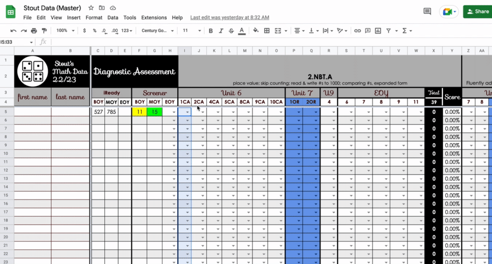
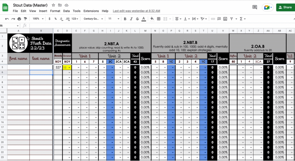
This shortcut became a time saver for me because I am assigning a different value or weight to different test questions within a single test. The math program we use at my school tests a bunch of different standards on one test––not just one strand at a time. I have to figure out which standard correlates to each individual problem on the test and record them under a separate standard in my grade book (rather than one score for the whole test). So problem #1 which tests standard 2.NBT.1, for example, might have 3 parts (a, b, c), so I want it to be worth 3 points. But problem #2, which tests 2.OA.2, might only be worth 1 point. Using a drop down menu helps me remember how heavily I weighted each test question when I'm recording the grade so I stay consistent. To make a drop down menu, highlight the whole column, and go to Data––data validation––list of items. I always use 'list of items' and then list the numbers possible separating them with a comma like this: 1, 2, 3. I like it because it puts the number choices in the drop down menu for you to choose. Then click on the arrow to choose one of those numbers.
3. Color Code the DataFormat––conditional formatting–format rules–"is equal to"–change the default color with the paint bucket
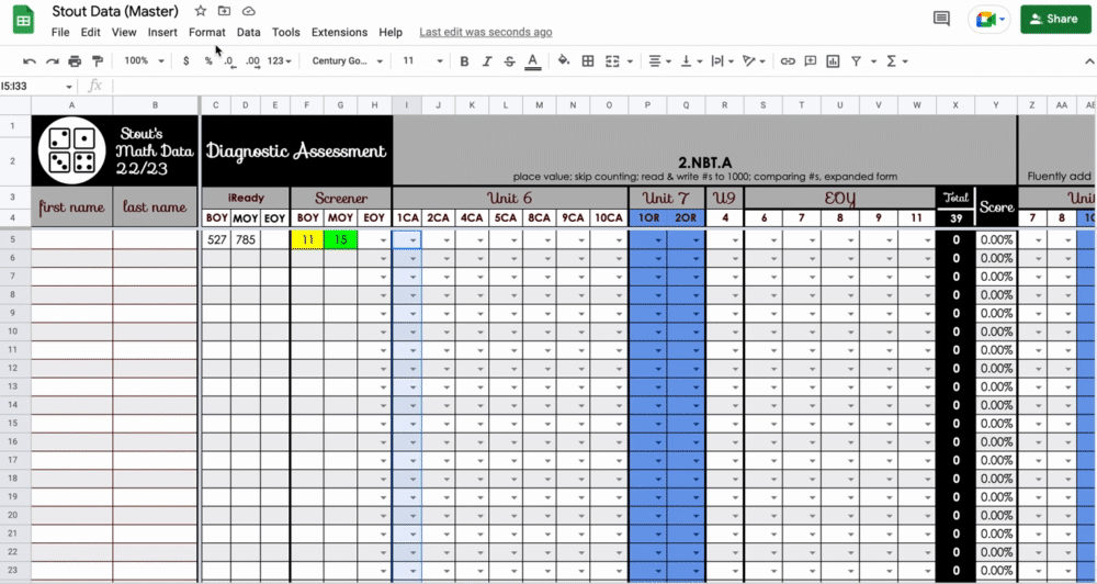
This shortcut has made the biggest difference for me! I like to see a data page color coded so I can get a sense of whether a student (or my whole class) is passing a standard at a glance. For example, if I have a problem worth 3 points, I can make 1 out of 3 points unsatisfactory and color code it red; 2 out of 3 points would be partially proficient and I would color it yellow; and 3 out of 3 points would be proficient and I would color it green. Then at a glance I can see if a lot of kids missed a certain question by the colors I see going down that column. I was color coding my data before, but I would highlight and change the color in each individual box. Conditional formatting has revolutionized my data analysis! I can set a whole column at one time to change the color of the box when I put the score in. Just highlight the column or row that you want to color code using the same data parameters. Go to Format––conditional formatting–format rules–"is equal to"–change the default color with the paint bucket. Now when you type in a number or choose a number from the drop down menu, it will automatically change the color based on the rules you set.
4. Average the Score:
=(click in the box of the student total)/(click in box of the total possible)

Going back to my math test example, I have random test questions across several units that fall under one standard. We use standards-based grading, so I average all of those individual test questions over several different units to determine how the student is doing on that one standard. To do this, first I have a total column at the end of each standard, and I have the spreadsheet automatically add up the total number of points the student earned for that standard (see the blog post Create Your Own Auto-Filling Data Spreadsheet With These 4 Tips for directions on automatically adding totals). For example, if unit 6 had five test questions for standard 2.NBT.B, and unit 7 had four test questions for 2.NBT.B, I have a box at the top of the spreadsheet with the total number of points possible––in this example 24––and then the spreadsheet calculates the total number that student earned. In the "Score" column, I have the spreadsheet average the score and turn it into a percent. To do this, click in the "Score" box for the first student and type =. Then click on that student's "total" box and it will add it to the formula. Next hit the / (which means divided by) and click on the box that has the total number of points possible. My formula for this example looks like this: =X5/X4
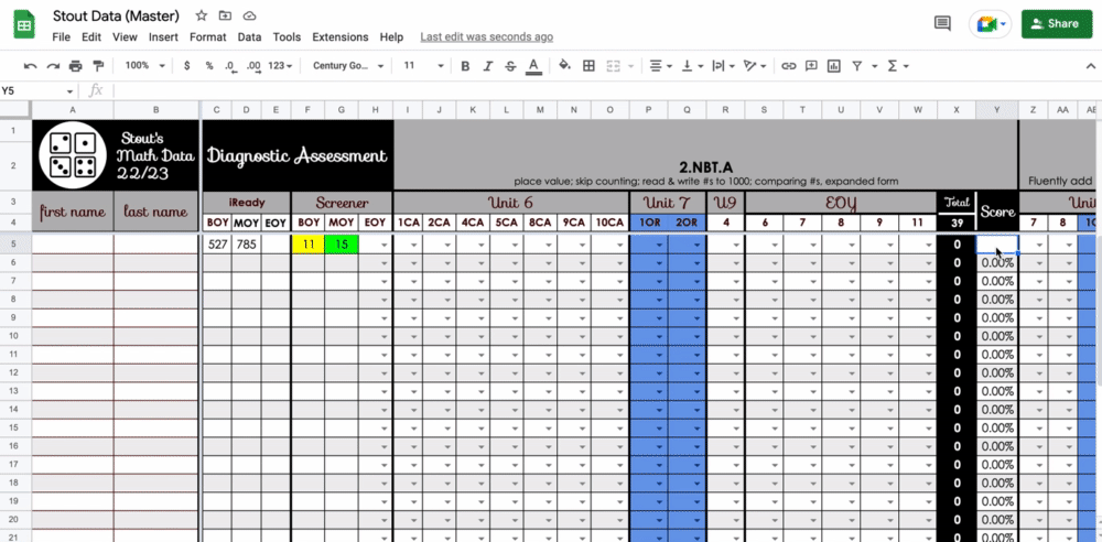
To make sure the score is shown as a percentage, highlight the whole score column and click on the picture of the % on the toolbar across the top. Now at a glance you can see which students are passing the standard over time.
I also have a blog post that I published a few years ago called Create Your Own Auto-Filling Data Spreadsheet With These 4 Tips. It shows you how to freeze rows and columns, automatically add totals, automatically populate data on a shared page, and create pivot tables to analyze data. You should check it out for ways to make your data tracker even more legit.
I hope you find these tips helpful in saving you time during your data collecting!


No comments