This is a bit late, (we started school in the middle of Aug., so this is a room that has been used for a month and a half) but better late than never! I have gone back into the classroom after being a tech coach for the last 6 or 7 years. This year I am teaching first grade, and I am really excited to incorporate flexible seating and a maker culture in my classroom. Last year, I got to hear keynote speaker Dr. Robert Dillon, author of The Space A Guide for Educators. He talks about the brain research behind designing a classroom with purpose and using the space intentionally. In his article 7 Tips for Moving From Decorating to Designing Classrooms, he says, "Ideally, schools would be taking time to study and design with intention spaces that support excellent learning." Going back into the classroom with a plan for how I wanted students to use the space in their learning gave me a chance to design my new classroom with some key principles in mind. Here is my classroom . . .
I used an intentional color palette instead of a theme–I was going for a cozy farmhouse feel where the students and I will enjoy spending time. Dr. Dillon says, "Research continues to emerge that an intentional color palette enhances learning. Too many spaces look like a bag of skittles exploded with every color of the rainbow represented in the rugs, furniture, and items on the wall. Designers are looking for a base color with a couple of accent colors. Classroom decorators, though, are adding flare and pop, and this rarely helps with the focus or calm of a space." This brain research has actually been around for awhile. In 2005, Eric Jensen published Teaching With the Brain in Mind. His research stated that warmer colors such as red and yellow stimulate students, and cooler colors such as light blue have a calming effect.
I did a makeover in 2011 after taking a class about how to use brain research to create an inviting classroom. I wrote this advice on my blog which I learned from my class at that time, and it still rings true: "Decorate your classroom the way you would decorate your house. Would you splash bright blue, yellow, red, and green on your walls at home? Then you shouldn’t do it in your classroom either. Pick 1-2 main colors and an accent color. Make it something that makes you feel comfortable because you do spend 7 hours (ha! Usually more) a day there. Use color to draw attention to what you want your students to focus on. When that learning focus is over, take it down and highlight something new. The novelty of changing what you hang on the wall keeps things interesting and it keeps students attention. I wasn’t sure about this at first. I’ve heard it all before, but I was sure my students liked all the bright colors and stuff on the walls, and they probably did. But if my purpose is to emphasize a particular skill or concept, having lots of “stuff” everywhere wasn’t helping me accomplish that. Too much visual clutter can be distracting and then students don’t use it as a teaching tool. Effective teachers focus on one concept or theme to make a students’ understanding deep, not a little bit everything all at once." You can see my first makeover and advice here on my old blog.
This time around, I had already gotten rid of a lot of my "stuff" from being in the classroom before, and I am determined to keep things decluttered so the space feels big, open, and inviting. I kept the blue accent color I had in 2011 for a calming effect, but I updated the look of my classroom with a softer gray and white shiplap. The gray rug is from Amazon, and it ties the room together nicely!
Our school got new cloud tables this year, which I LOVE! They seat 6 students per table. I have 2 tables that are chair height and 2 tables that students sit on the floor to use. They are free to move to whatever space best meets their need depending on what they are working on, as long as they are making good choices. I also have spaces around the perimeter that are less collaborative work spaces that seat one or two students because they need the option for time to work by themselves as well. Dr. Dillon writes, "It is essential that students can choose the seating that meets their learning task and their learning style, but adding neat items to the classroom for novelty will get the undesired effect of students focused on furniture instead of their future."
Empowering them with the choice of where they work is going really well! Of course there have been times that I have needed to choose for some students who weren't making good choices, but honestly, I think my students are more productive when they get to decide what best meets their needs. It's less of a power struggle, and it helps students become more aware and self regulate what they need to do their best learning.
I found the supplies caddies on clearance at Walmart at the end of the summer for $5. Score! They were picnic caddies that were supposed to hold ketchup, forks, etc., but they also work great for our pencils, dry erase markers, glue, and sticky notes!
This is the front of the room. On the left is a chalkboard schedule for my students. My husband made the chalkboard, and I put up words, pictures, and clocks so the students can keep track of when things happen throughout the day. I didn't want a million questions about when recess begins, so they are responsible for looking at the hands on the clock to figure it out. Even if they don't know how to tell time, they can look at the hands on the clock to see where we are in our day and what is coming next. So far, it's working!
This is the front of the room where we gather. I found the chair and the little shelf under the board at Good Will. They just needed a little cleaning and some paint! The pillow that says "gather" and the crate next to the chair with our read aloud books are from Hobby Lobby. The clock is to help students manage their time. I can color in how many minutes they have to complete a task using a dry erase marker so they can see the time elapse. This is a tip I learned from a class I took this summer about helping students self-regulate and organize. It's really helpful!
On top of the little shelf are 3 plastic jars that say "Save, Spend, Give," which is part of our Social Studies standards. We have SOAR bucks as part of our PBiS program, and when students earn one, we put it in our "Save" jar. As a class, we vote on how we want to spend our money using the option board above.
This tall table is off to the side of the board where I keep my computer and a tall stool. My computer can connect to the projector wirelessly with a screen beam, so I use it as my doc camera too without all the wires and mess! I can just pick up the tablet part of my computer and walk around the room while writing on it, and it projects on the board. It's awesome!
This is part of my classroom library. The shelf in the middle was made by my husband years ago when I was a classroom teacher before. The shelf on the right is from Ikea, I just turned it on its side so I could display books. I got plate or frame displays from the dollar store to display the books. The shelf on the left hand side is also from Ikea. I use it to hold specific authors we like to read. The wall behind the shelves is an ugly collapsable wall, so my husband and I covered it with shiplap paper I got from Lakeshore (yep–I'm a big Fixer Upper fan!). This fadeless paper is thicker than normal paper, and you can even write on it with a dry erase marker. I use the big sticky note chart paper for our anchor charts from the Units of Study Reading, Writing and Phonics lessons. It can come on and off that shiplap paper easily, so I can move the anchor chart around. I love the sticky notes from these programs because I can put them up when they are our teaching point, and when we move on to new teaching points, I put the sticky notes in a folder full of blank paper so we can reference it if necessary, but we don't have to have it taking up space and distracting us from our main learning target.
On top of my bookshelf is a framed print illustrated by Peter Reynolds. It says, "I Love My Library." I was so excited when I found these from thedotcentral.com. You can order them, and even have them autographed!
My library continues around the corner with a comfy leather chair I got for free on Facebook Market Place, and a pillow from Hobby Lobby that says, "Let's Get Cozy."
This is my son who couldn't resist reading a book in this space. There is a basket full of stuffed animals next to the chair that make great reading buddies!
There are 2 shelves from Ikea laid down end to end to form a bench with pillows on top that the students sit on, especially during independent and buddy reading time. Under the bench are more books separated by genre and author. Above that is the word wall. On top you can see the 3 verbs I chose to describe the kind of learning that I want to happen my classroom. Dr. Robert Dillon inspired me during his talk when he shared his idea about choosing 3 verbs: "Design requires a human-centered lens that allows you to understand the true purpose of a space. When teachers and leaders know the verbs of their space, they have a deeper level of intentionality. Is your space designed to explore, investigate, and discover? Is your space designed to create, make, and tinker? This clarity makes decoration seem like frosting instead of missional." He also talked about how much of the space in your room is really for the students to use, and how much is unintentionally off limits because it's full of your "stuff." I'm determined to have less "stuff" so I can give more space to the students. I'm keeping my "stuff" digital as much as possible so it doesn't become clutter!
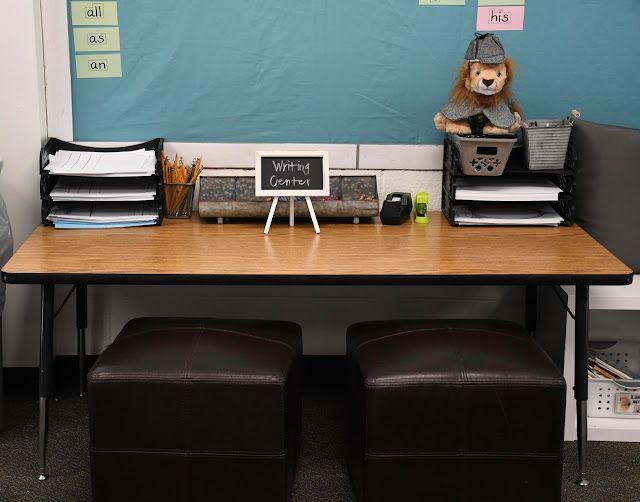
The writing center is also under the word wall, and it has writing tools that the students use everyday. There are blank books with different kinds of paper that the students write their stories in, pencils, crayons, tape, a stapler, and of course Rasheed, our class mascot (from the Lucy Caulkins Phonics program). We are currently word detectives, so he is dressed like a detective!
I got these cute little chalkboard displays on clearance at Michaels this summer, and I used a chalk marker to write on them.
This super cute crayon caddy is from Hobby Lobby. I got the idea for a crayon caddy from my teammate, Kelsey at Teaching Tiny Techies. If a student loses a crayon, they just get another one. If we find some on the floor, we just put it back in our crayon caddy. It's just not worth the time to figure out whose missing crayon is on the floor!
On the other side of the room are my STEAM bins. These little white baskets (from the Dollar Tree) hold STEAM activities I found from Sarah Cooley on TpT. We have a soft start, which means that students can come into the classroom anytime between 7:40 - 8:00 before the bell rings. They can grab these activities and work on them until the bell rings. We also make time on Friday for students to do these STEAM activities if they have done their homework. They absolutely LOVE them! It's incredible! Create is one of my classroom words, and incorporating STEAM is important to me because I think it is so valuable as a learning opportunity for kids. Dr. Dillon says, "If we keep designing makerspaces, isolated from classroom learning, with no plan to close them in lieu of a maker culture, we are building this decade’s computer lab. We need to instead think about creating a culture of making in every classroom. This doesn’t mean that we are putting 3D printers in every classroom, but maybe we are adding cardboard and low-tech creation items in all spaces. Allow students to showcase their learning in a variety of ways. Don’t limit making to space or specific time of the day." One of the STEAM bins is just an open explore bin that has cardboard, bubble wrap, paper towel tubes, etc. Whenever a we empty a Kleenex box or a box that held snacks, it goes into that bin. They. Love. It! I had no idea just how important is to them to have open-ended opportunities to create, but I won't forget. They have created fidget tools that go into our calming corner, settings for stories that we have read, and more.
I got another print from Peter Reynolds that is hanging in the STEAM area. It autographed to my class!
This is my technology center. This is a sitting table with cushions my mom made (thanks mom!). The headphone/iPad stands are from Ikea. We use it for uploading our learning to Seesaw, reading or listening to reading with Epic! and eventually Overdrive, and I also have 2 Osmos that the students have used for math, sight word practice, and coding. They are amazing learning tools! I also have 5 chromebooks that we sometimes use for websites connected to our math unit.
SOAR is our PBiS word which stands for Safe, Open-hearted, Achieve, and Resilience. I used the clock as the "O" in SOAR. The kids made a name banner that is hanging across the top of the board, and there are more flexible seating options you can see next to the technology center. The students love to sit on the floor using the lap desks!
This is my calming corner, which I call Australia from the book Alexander and the Terrible, Horrible, No Good, Very Bad Day. If the students are having a bad day like Alexander, they can visit Australia to self-regulate. There are fidget tools, a folder with self-regulation strategies when students are in different zones that make it difficult for them to stay focused (check out this resource from Kelsey at Teaching Tiny Techies for Self-Regulation Strategies), and this beautiful poem I found on Amy Ludwig VanDerwater's blog The Poem Farm called It's ok. If you haven't ever checked out her blog, it's amazing! She is a published poet that is the co-author of the poetry chapter in the Units of Study in Writing with Lucy Caulkins. She writes original poetry on her blog with students as her audience, and she records herself reading each one. She often has a follow up teaching point for students too. With this beautiful poem, It's ok, I have students draw something that they may not be feeling great about that is ok. Sometimes I decide students need to visit Australia too when they are having trouble self-regulating.
This is a standing table that also has tall stools. The kids love to work here, not just as a place for self regulation, but to work too. I love that it doesn't have a negative connotation, and it can be used as a flexible space in our classroom!
Next to Australia is the math area. This shelf (and the matching shelf on the other side holding the STEAM bins) was made by my awesome husband. They hold our math tools and bins of Legos that we use for various maker projects. You can also see the little trash cans from the dollar store that we use when cutting or doing something messy to contain the trash!
This is my small group area.
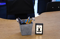
I got this super cute little light guy from Amazon. When the light is on, the students cannot interrupt. They love it! So far, they've been great about not interrupting!
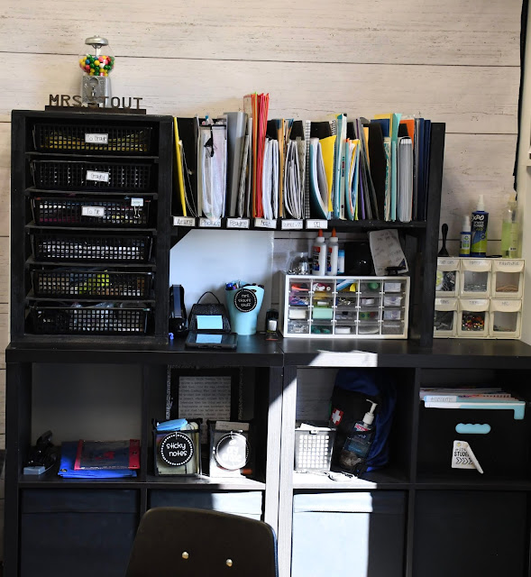
Behind my small group table is where I keep my teacher stuff. I don't have a desk exactly, but I am not organized enough not to have a place where I put my stuff. There are 2 cube shelves put together from Ikea, and years ago my husband made the shelf that sits on top with basket drawers and little cubbies for each subject across the top. I also have cube drawers on the bottom, and I'm doing my best to stay organized with this great set up!
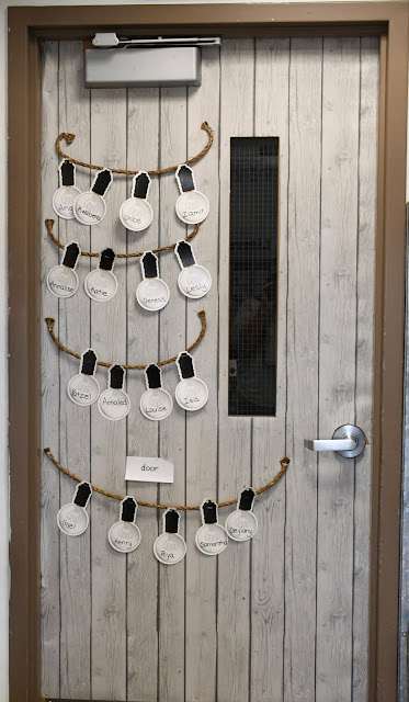
And this is my door with student names on the light bulbs (minus a few that fell off). I am loving my classroom, and so are my students! Although it gets a little messy at times, we have done a pretty good job of keeping it clean and cozy. It's going to be a great year!


No comments