

This summer I became Level 1 and Level 2 Google Certified. Woot woot! I even got to visit the Google faciity in Boulder which was AMAZING! Some of the things that I learned make analyzing team data much easier. For example, the kindergarten team at my school assesses students with the Literacy Skills Assessment 3 times a year. They wanted an easy way to compile the data from all of their classes to analyze how all students in kindergarten are performing.
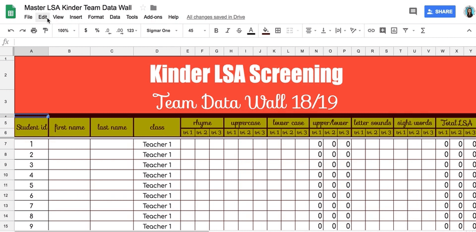
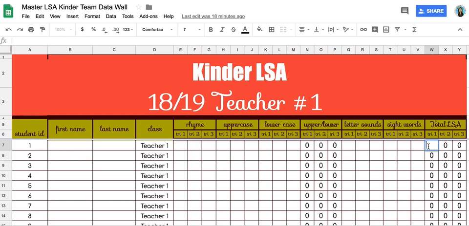
First, I created a google sheet that had a page for each individual teacher on the team and one page for the whole grade level called the Team Data Wall.
1. Freeze Rows
This is simple, but important! You want to freeze your headers or titles so that when you sort data, it doesn't move the headers into your data. Go to View–Freeze–2 rows. I needed more than 2 rows frozen because I have a big header. A line shows up to show you which rows are frozen. You can just grab the line and pull it down to freeze more rows.
2. Automatically Add Totals
Another simple but time-saving trick is to make sure your spreadsheet does the math for you. On this google sheet, there is a column called upper/lower that calculates the total number of upper and lower case letters that the student knows. The total LSA score is all the data added together. These columns are set up to automatically add the total scores for each trimester. To do this, click in the box you want to calculate the total and type =SUM. Next, click in the boxes that you want added together with a comma between the numbers. My code in the example is =SUM(E7,N7,Q7,T7). Once you create the command for one box, you can copy and paste in another box. It will automatically adjust to fit the numbers in that row.
3. Automatically Populate Data on a Shared Page
This gets a little more sophisticated, but it's one of the features I'm most excited about! I found the video above which does a nice job walking you through each step of combining data onto a new page. The problem we had when analyzing this data before was that the teachers wanted to see their individual classroom data, but they also wanted to see the data as a whole grade level. That meant they were typing the info in more than one place, which was a waste of time. This feature let's teachers type in the names of students and data on their individual classroom page, and it automatically shows up on the Team Data Wall. This is the function I added to do this on my Team Data Wall:
=QUERY({'Teacher #1'!A7:Y;'Teacher #2'!A7:Y;'Teacher #3'!A7:Y;'Teacher #4'!A7:Y;'Teacher #5'!A7:Y},"select * where Col1 is not null",0).
The information from every classroom is automatically entered. Such a time-saver! The downside is that you cannot sort the data on the Team Data Wall itself. You can only sort it on the original page, but that is where pivot charts come in handy.
4. Create Pivot Tables to Analyze the Data

Pivot tables let you analyze a large set of data in different ways. For example, this sample pivot table shows us column A is the number of rhyming words students knew, and you can see how many students in each class knew that number of rhyming words by following the columns across the top. Therefore, 2 students in Teacher 1's class and 2 students in Teacher 2's class knew 0 rhyming words. It also gives a grand total of students in kindergarten that knew 0 rhyming words. Just move down the rows in column A and follow the data across to see how many students knew 1 - 10 rhyming words. These pivot tables do live updates, so as soon as the data changes, so does the chart.
Creating pivot tables on my spreadsheet makes me feel like a real coder! It seems really fancy, and while this is the most difficult tip in this post, it is really not that hard to do once you get the hang of it. The video above is a little long, but it shows you how to create different kinds of pivot tables in your google sheet. You really need to watch the video to understand the logistics of how to create and code your pivot table, but here is the data I used to create the example pivot table on rhyming words.

These tips can help you analyze your grade level data much more efficiently! You can also download a copy of my LSA Kinder Team Data Wall here on Teacher Sherpa if you don't want to make your own. Happy analyzing!


No comments